Are you utilizing landing pages in your business? Landing pages are standalone pages created for individual marketing campaigns. They usually have a single, highly specific offer. And, an effective landing page has great ROI.
Simply put, landing pages are a smart way to drive more traffic and leads towards your products or services. Among numerous other benefits, they are also a fantastic tool for growing your brand, expanding your customer reach, and improving your SEO results.
They also have a fantastic ROI because of their highly targeted messages. So, what makes for a quality landing page?
- They are free of distractions.
- They zero-in on one specific offer.
- They target a specific audience.
- They are highly optimized for their campaigns.
- They get right to the point and don’t intimidate.
I’m here to convince you that you should, in fact, be taking the time to invest in landing pages as they are a fantastic business, marketing, and sales tool. I’m going to do so by breaking down four elements of an effective landing page. This way, I can demystify any hesitations as to what it takes to create effective landing pages.
1. Matching expectations
It’s essential to recognize the context a visitor has if you’re looking to create an effective landing page. There are numerous ways for a visitor to land on your page. Someone can click on a search results link, on a Facebook ad, a link from a friend, or through a link from your company’s drip campaign. Each of those individuals will have different understandings of your company and your services.
Therefore, someone who never heard of your company before might need different information than someone who has been on your waiting list for a few weeks now. Giving someone the right context makes for an effective landing page and improved conversion rates.
Additionally, your landing page needs to ensure the content on it matches the promise of the link. For example, I click through on a Facebook ad about a book on creating and setting up your first ever webinar. Yet, once I’m on the landing page, the headline talks about leveraging webinars to make a side income. That’s an inconsistent message. Therefore, bounce rates go way up, and conversion rates go down. It’s all because the landing page didn’t live up to the promise of the link I clicked. Such mixed messages don’t ensure an effective landing page.
2. Your unique offer
The offer within your landing page is the landing page’s unique selling point or value proposition. It is whatever makes your offer the right solution to the customer’s problem, especially over your competition. The offer needs to be evident within seconds of a visitor seeing your page. Don’t forget, the most effective landing pages are highly targeted.
You can focus on a single service, a single product, or a single feature of a product. It’s the difference between selling general copywriting services and selling your latest book. When you tie that offer to a more specific pain point or need your a target audience has, the landing page and the offer become significantly more powerful. Think of your landing page’s offer as the unique story the page is trying to share with your target audience.
You can use a simple 15-second test to determine if your landing page’s offer is easy to understand. Show your landing page to someone who hasn’t heard about the campaign yet for 15 seconds. Ask them to tell you what the page was about. If they have a clear answer to this question, your landing page has excellent comprehension. If they don’t have a clear answer, it’s time to iterate.
How can you ensure your page is effective and easy to comprehend? There are three components that significantly impact a landing page’s comprehension:
- heading and subheading
- above the fold visuals
- the offer details
A. The heading and subheading
The landing page’s primary headline and subheading are the first component of an effective landing page and have two crucial roles. The heading is supposed to tell the visitor that they are, in fact, in the right place. It keeps the promise of the link the visitor clicked on. It’s there to iterate and summarize the landing page’s offer.
The subheading is there to get the visitor interested to learn more. Basically, the subheading is meant to get the visitor to scroll. It’s also there to prepare the visitor for the CTA.
Let me give you a couple of examples:
- Heading: Stay healthy in 2020 with stronger muscles and higher flexibility
- Subheading: Book a free intro yoga class with Jasmine
- CTA: Secure your spot
- Heading: Live confidently and be a debt-free Millenia
- Subheading: Grab your 5-step guide for reaching financial stability
- CTA: Download the worksheet
B. Above the fold visuals
If the main heading and subheading explain the offer verbally, we also have to do so visually. After all, our brains capture and understand visual communication significantly faster and with much less effort than written communication. It also draws a person’s attention quicker.
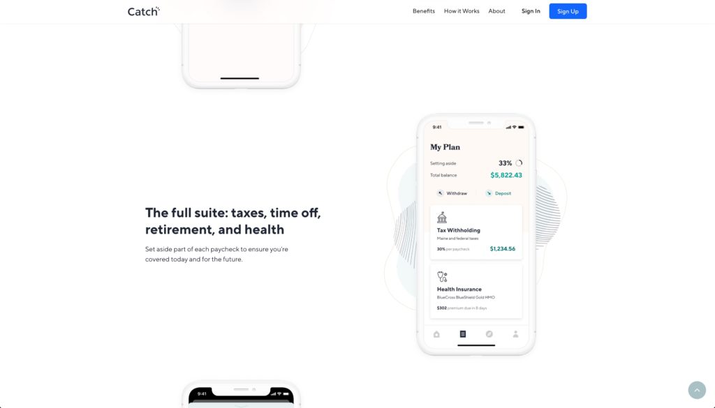
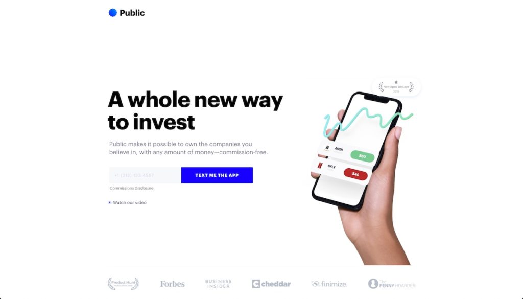
The most important fact is to have a visual representation of the offer, one that shows not tells the offer’s value, above the fold. A full hero background image is the most common way to do this. But, it’s not the only way. It can be a graphic, a video, or an illustration, as long as it gets the point across. Basically, showing visuals above the fold is a great way to ensure you’re creating an effective landing page.
For a yoga studio’s landing page, you shouldn’t want to use an image of a yoga mat because it doesn’t show the value. Instead, you’d want to show participants from one of your classes. If the offer is about stronger muscles, show students performing a challenging pose.
Allow the image to reinforce the offer and literally paint the picture of what the offer will do for the visitor.
C. The offer details
Now, let’s go over the offer’s details; essentially, they’re the benefits or key value propositions of the offer. They will depend on the problem your target audience needs solving and the pain points they’re experiencing. Customer research will tell you exactly what your customers want to hear!
If your landing page targets Millenials trying to get out of student loan debt, tailor your offer’s benefits to those financial pain points.
The other thing is that these benefits will need to be easy to spot within the landing page. The 15-second comprehension test I mentioned earlier will make it clear if these benefits and value propositions are clear or not. If the benefits of the offer aren’t easy to find or understand, you won’t be able to continue telling your story, which will significantly decrease your conversion rates.
3. Use social proof
Social proof is a proven way to build customer trust; it’s a powerful, powerful tool. People have been studying it for years and years, there’s plenty of data to back it up.
There are verity social proof formats such as testimonials/quotes, star ratings, inserted tweets, case studies, and so on. The more of it you have sprinkled throughout the page, the batter. Therefore, if you want to launch an effective landing page, you must include some social proof on the page.
What makes social proof so powerful?
Social proof has three key components that make is such a powerful conversion driver. First, it does build trust that you’re reliable and credible. Second, the testimonial validates that your solution is the right one for the prospect. Third, it perpetuates the herd mentality.
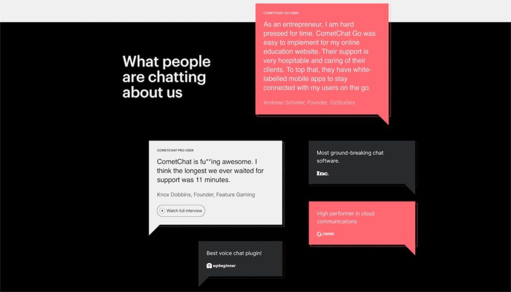
Online reviews are mighty. So much so that people will often look up online reviews of products while they’re shopping in physical stores too. Simply put, no matter how trustworthy you think you are, some people will always be skeptical about buying a new product or service – even if they’ve bought something else from you in the past.
4. The call to action
Naturally, a call to action (CTA) is extremely vital to your landing page; people won’t be able to convert without them. They will land on your page, and they’ll love your offer, and no matter how much they want to give you their money, they won’t be able to.
What do you need to know about effective CTAs?
First, make sure you have only one CTA for an effective landing page. You want to keep the attention of that visitor focused on what you’re trying to get them to do there. You worked very hard to get that lead to your landing page, you don’t want them going off and getting lost anywhere else. However, you can use as many different buttons as you need to on your landing page. The point is only to have a single outgoing action, such as buying an eBook or signing up for a free yoga class. Nothing else.
Avoid any other external links as much as possible. If you want to provide more information, do it in a modal or a lightbox. The only way out of your landing page is to leave it altogether or further down the conversion funnel – such as a check out page. For example, say you have an explanatory video, instead of linking to YouTube, embed it in a lightbox.
You’ve worked too hard to get these people here to let them get away. Don’t shoot yourself in the foot.
Bonus pro-tip: Always test your landing page
Even though the above four elements are an excellent formula for creating an effective landing page, it’s still just a start. The surest way to make the most effective landing pages is always to test, iterate, and improve upon them. Therefore, to ensure higher ROI is to learn and iterate.
The takeaway
Overall, landing pages are a smart investment for driving more traffic to your site and gaining more leads. The above four elements are a great starting framework for a high-converting landing page. As you can see, it doesn’t take much to make an effective landing page. As long as you have a single idea (aka offer) and a good understanding of your target audience’s needs, you’ll do great!


