TOP Mortgage
Reimagining teaching within the montage industry
TOP wants to help struggling or plateaued mortgage brokers to level up their income growth by teaching them the work ethics and “secrets” of the industry’s top performance.
The challenge
TOP’s biggest concern was how to make learning natural and comfortable. The primary goal was to create an online education experience that helped their students learn effectively. We wanted to make sure that the students retained the knowledge and were able to learn it in a practical, not theoretical, way.
Services provided
The approach
To achieve our goal, we put a lot of focus on the user experience, which led to developing a brand new system for their web app. The product was designed strategically to included gamification, behavioral patterns, and the most straightforward information architecture for their massive library of content. Each feature and idea ware scrutinized to make sure it added value to the studnets and helped them learn effectively as well as how the functionality would fit into the product holistically.
The target audience
The target audience consisted of predominantly men from their late 20’s to 50’s with at least 2-3 years of experience in their field. The audience had a specific inclination to improve their business results and willingness to learn. TOP aimed to attract go-getters and doers. That’s because people who expect things to be handed to them wouldn’t go very far within the structure of TOP’s program. Additionally, user profiling revealed that because these users were motivated, it was the lack of information that stopped them from improving their professional results. This information significantly affected the design of the experience.
Furthermore, this audience consisted of two main subcategories of people: those struggling to make a decent income, ~50k+ a year, as well as those wanting to seriously advance their business to half a million revenue or above.
Although the current release targeted brokers in California and Illinois, long-term the product was for all of the US states upon the public launch.
Articles
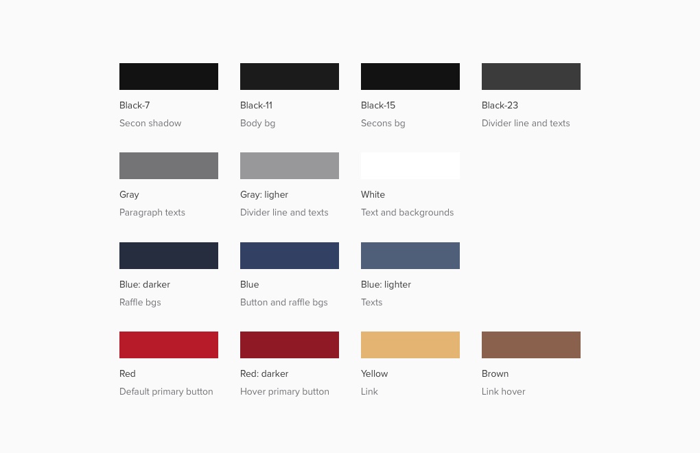
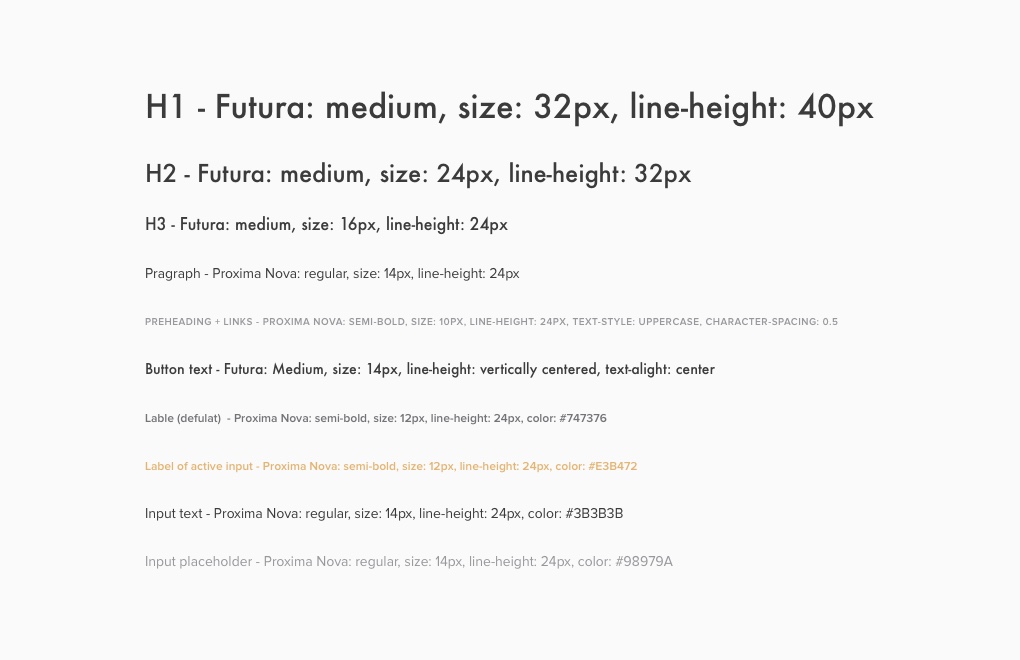
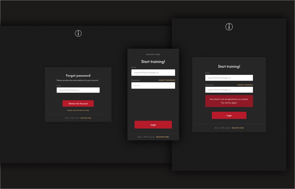
The branding
TOP requested to completely revamp the visual design, as their previous product’s visual design was taken from a UI template. We kicked off the branding process with a lengthy questionnaire which served two purposes. First, for me to get inside the head of the stakeholders at TOP to see what they’re thinking and envisioning. Second, to put those thoughts onto paper.
Shortly we had a new brand direction: exclusive, high-end, and authentic.
The sense of exclusivity was vital. After all, we’re talking about high-end, top earners and becoming one yourself. This is special; this is exclusive. We wanted to make the students feel like they have just joined a private club.
Additionally, since the target audience was largely male, it was okay to create a brand with an edgy, masculine look and feel.
Articles
A brand exists in the minds of your customers. A brand is the sum total of impressions a customer has, based on every interaction they have had with you, your company, and your products.
Robison Wells, What is branding?
“I had the pleasure of working with Paula on a startup project with TOP Mortgage Training. Paula was at the forefront of the project, developing a comprehensive design for our platform. She has a true understanding of the user and was able to create a functional and appealing design with true flow. I would not hesitate to work with Paula on future projects and highly recommend her for yours!”
Jessica Elledge, Director of Training, TOP
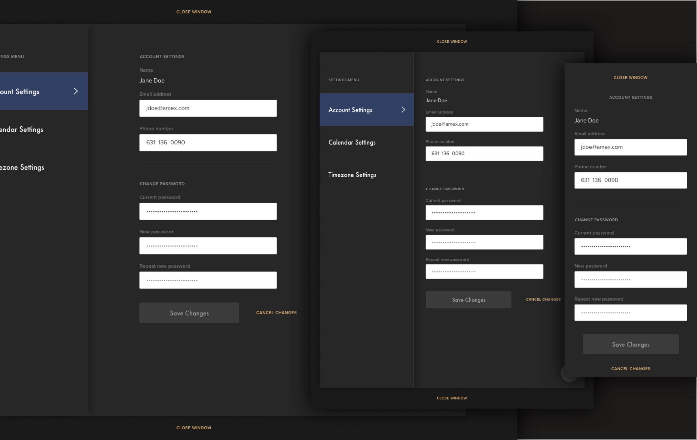
The product design
Taking inspiration from 1-to-1 human interactions and bots, the product had to be smart, intuitive, and adaptable.
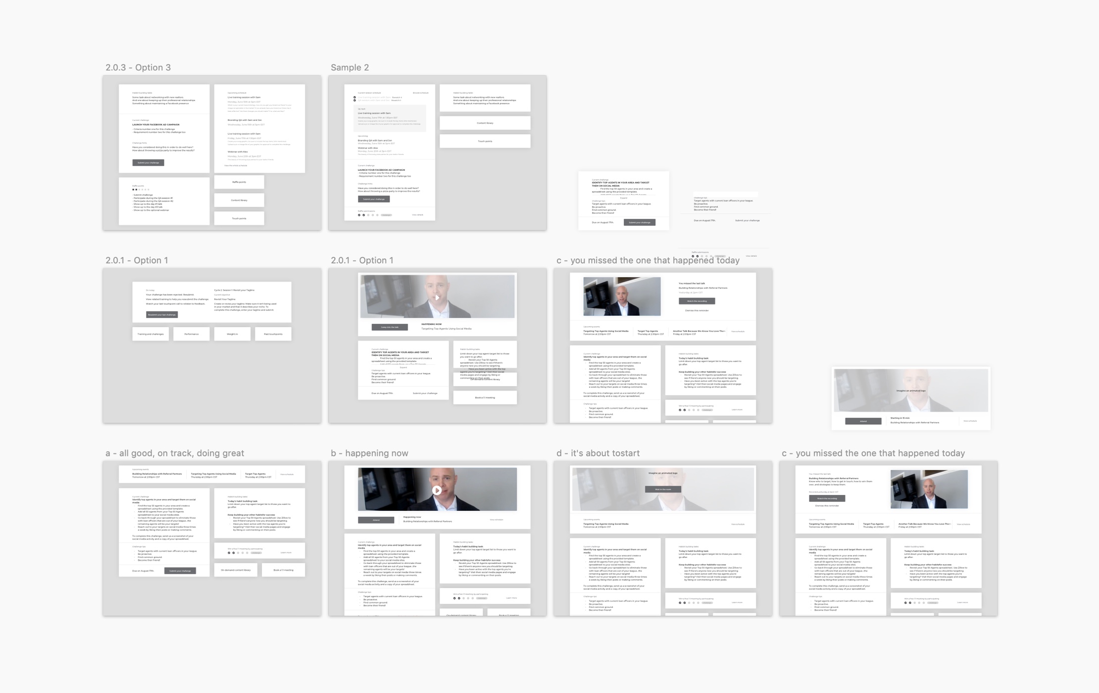
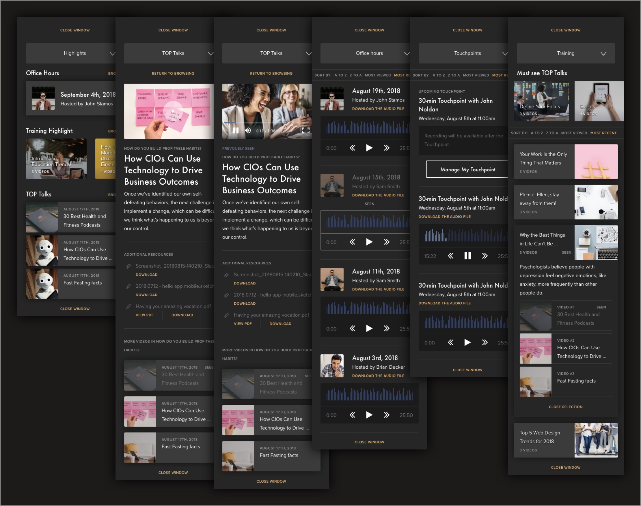
To make the online education experience coherent and, even enjoyable, we had to make sure that the students had a sense of accomplishment. The lessons and course work were divided into manageable chunks. Moreover, the student’s whole educational journey with TOP had to be well archived and tracked as well.
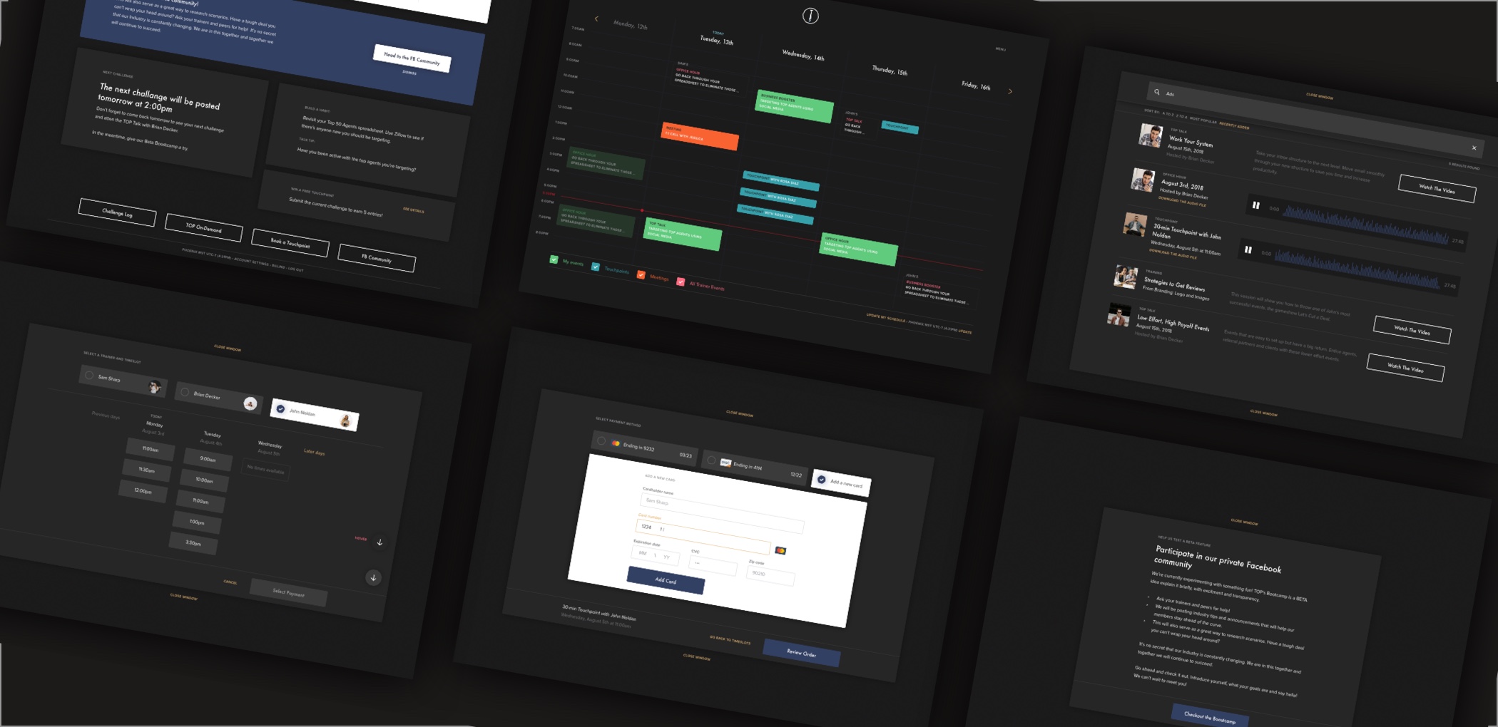
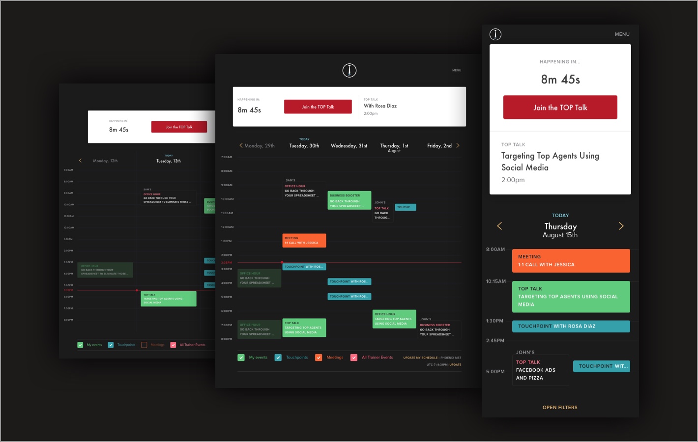
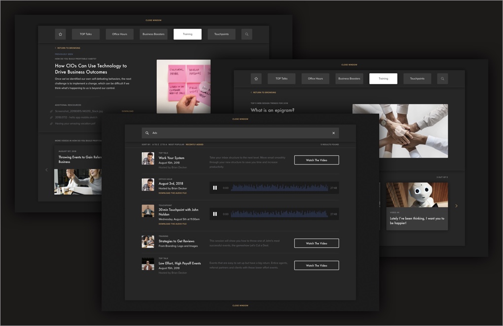
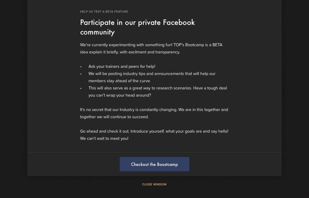
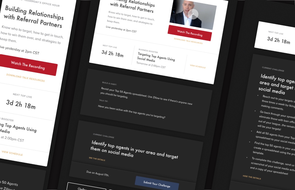
Besides the course work itself, the instructors held live online events (similar to office hours or webinars) multiple times a week. This gave many students another reason to regularly check back.
The experinece had to feel seamless
In order to ensure the product experience felt seamless, we customized the dashboard to show the most relevant information in real time, such as an upcoming assignment due dates, a pending lesson or a forthcoming private 1-on-1 touchpoint.
The idea was to make sure the students felt like everything and anything they needed was available to them at their fingertips. The dashboard acted as their assistant to help the student be organized, informed, and on track. This wouldn’t have been possible with a static dashboard.
Articles
A holistic flow
Additionally, there was still a lot going on within the product, even for a massively simplified version. To make sure the students didn’t feel overwhelmed or confused, we removed as much complexity from the different features and interactions as possible.
This goal forces us to think through the different UX flows holistically for individual features – especially where their functions overlapped. That’s why the highest priority was to develop a grand sense of flow within the product as a whole. We achieved this by removing all dead ends, making sure that a student can go back a step or move forward at any stage with ease.
Sticking to the core
We cut down a lot of ideas and features to a limited list of priorities. Partly because of a time crunch – we originally had a 3-month schedule including development. But, also due to the importance of improving simplicity and avoiding unnecessary complexity at all costs.
Cutting out functionality and features became a regular thing for us. If it didn’t add value to the student on a notable scale, it wasn’t going to get added to the product. Because the user experience was so heavily and carefully thought out at the beginning of our collaboration, it was easy for us to remove unnecessary complexity as the project progresses.
Articles

A fantastic collaboration
Alongside the TOP team – the CEO, Director of Training, and Lead Engineer – we conducted several meetings where we discussed the necessary features and interactions we needed to create. The data they have gathered in their previous test run as well as my own user research were vital elements in determining our next course of action.
We talked about the scalability of the current ideas as well as how to best tackle the product development with the timeline and resources currently available to the company.
Managing the project
In addition to being hired by TOP to improve their current product, I was also responsible for project management.
Most often, I worked directly with the CEO to make sure he and I were on the same page regarding both user and business goals, design progress, and the like.
I collaborated with three developers on the product design but also about their workloads and timelines as a project manager.
Lastly, I worked with TOP’s Director of Training to make sure I understood the content requirements such as what’s a challenge and what information does the student need to provide, how, when and so on…
Articles
“Finding someone that is both talented and good at working with a team, is a big challenge. Being able to project idea visually in a beautiful and yet simple way is incredibly hard. This is why we work with Paula.”
Luis Ramos, Head Engineer at TOP
Full scope of the project
Project strategy
Heuristic evaluation
User research and interviews
Branding Strategy
Experience Strategy
Branding
Branding strategy
Visual identity and assets
Video course collateral
Brand guidelines
Product design
Information architecture
User joruney mapping
Wireframing
Visual and UI design
Interactive design
Pattern libraries
Responsive design
Project management
Timeline and deadline planning
Task management
Asset and deliverable tracking
Weekly and monthly agendas
Milestone setting and management